This is my previous Media Blog for my A Level Media work.
This Blog will now be used as a preview/teaser location for upcoming projects not involved with my A level work.
The purpose of reusing the blog was to show advancements in my work.
-
Conner
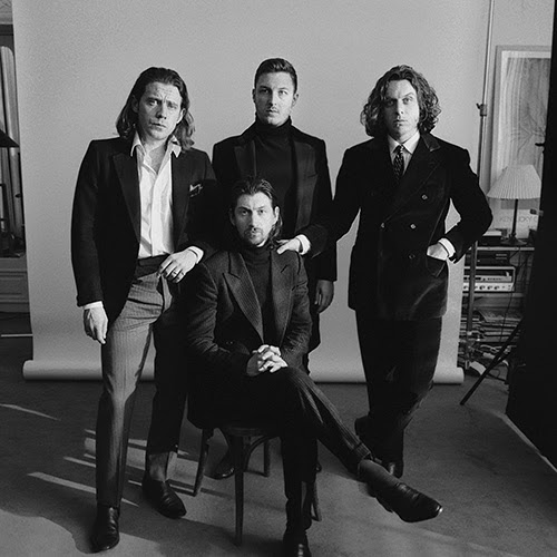
band name: Arctic Monkeys
Arctic Monkeys are an English indie rock band who initially formed in 2002 within the city of Sheffield, performing their first gig in around 2003.
The band currently consists of four people, Nick o'malley, Alex Turner (Lead), Jamie Cook and Matt Helders.
The music video:
When the sun goes down.
Release date: YouTube music video uploaded on the 10th of December in 2008
The song became no one in the UK indie and the UK singles charts and within the top 100 in the Netherlands.
The song itself is and still is relatively popular and has since 2008 got over 18,000 views
This music video is typical of Arctic monkeys being set in a suburban setting seemingly in the middle of a typically English city with a dull colour palette with a narrative. their music video View from the afternoon is one much like the one above however it doesn't move with the characters like this one does but it does stay in a similar style.
Audience:
This music video sets the audience pretty well in a few seconds of playing , this insn children's music video this is one for late teens to middle aged people. Due to the cold feel to the video as soon as it starts its safe to assume this video is intended for those of a higher maturity rate.
Late Teens to young adults are in the stage of full maturity and in the stages of coming to terms with the world around them and as such dark depressing themes presented within this music video such as prostitution (Heavily implied due to the nature of the song teaching that after dark the dark and depressing reality of the world is shown) and themes of violence which is portrayed by the male characters within the video. The audience is targeted by the use of the colour and mature themes present as well as the lyrics presented within.
The lyrics
"So who's that girl there" as a starting point instantly portrays this audience as realising the harsh reality behind them and its only really understood by those who have matured up and have learnt of the acts while growing up. The fact the song heavily implies by the use of the name of the song and the main lyrics being "They say it changes when the sun goes down" almost contradicts the viewers age and target audience by making it seem like its just a theory an unknown, meaning that the singer is unsure about what does happen and the video is only portraying it via the narrative.
the use of the magician in places also contradicts the audience as magicians are children entertainers, and involving one in this video seems slightly off and strange; but could also heavily imply that the viewer already knows what the song is about and its adding something to ease the tension. However this involvement using the magician might also be a symbol for the good in the world and that childhood are the most innocent years of someones life and this heavily aims for late teens to young adults by doing so.
The art style throughout the video is mostly of real life settings and locations making it more realtable for people who regularly walk the streets to realise. The Lyrics of "I hope your're not involved at all" are key pointers to those of consent as the video and lyrics point towards prostitution heavily and the lyrics themselves almost aim to stop people from becoming this way within society after all the way through the song showing it in a heavily negative way.
The visuals follow one man and the lyrics follow seemingly multiple and this subtle opposition between the visuals and the music itself this could show the audience of late teens/young adults by almost speaking to them in a way saying that this scenario can happen to anyone at any point, however is apparent that males are the main negative connotations within this music video as females seem to be the victim however its unclear to see which gender of audience would fit best, as Arctic Monkeys have a pretty big following with each gender (All)
the clothing the actors wear is casual clothing and nothing flashy at all hinting towards urban teens but this is a minor point due to the setting itself being one where walking down it in a fancy suit and tie wouldn't fit.
Webpage analysis
Arctic Monkeys website is dark and depressing compared to websites like green days which are vast in colour and this shows that the constructed audience is angsty teens or people who have a more darker and gloomier take on the world. Age wise the listeners vary between 16-25 years old who love the Colour black.
The webpage itself is really really bland and dull containing mostly just links to their band details but all link to different places of which have almost the same colour palette. It is extremely simple in design and so would appeal more to teens who just want to focus on the music or a little bit of news from the band every so often. The online store link is on the webpage as well as such it's obvious that the listeners of Arctic Monkeys buy there merch.
The website is perfect for their band as it's cold and dark much like their name suggests. It also suits the demographic of low income/suburban tribes being unable to afford the luxuries of more detailed and expensive things. Advertising is featured a lot on the website giving gig times and promotions allowing the fans to connect more with the band. In the left hand corner the Arctic Monkeys logo is seen which portrays their unique style of being cold and aside. Font wise it's simple and bland nothing really too special about their font but it could be so the fans themselves only want to listen to the music. In all their webpage isn't overly spectacular and it relatively simple and to the point much like how the Arctic is represented.
Arctic Monkeys have a very simplistic and overall very easy to read logo for their band, its unique enough to be able to be relatable and is widely known.
Audience profile for our music video
Potential demographics: Ages 16-25 or 18-24
most likely studying at school or at home but is in education
Generally scruffy or mixed in fashion sense potentially going through a rough time at school or just school in general and hating it.
basing our song and genre choice on bands like Arctic Monkeys the age demographic is most likely as has been noted earlier to be teens to young adults of which have access to internet services or are generally regularly socialising in general.
Habits in general are listing to music and just going through school or education in general potentially being a reject in some cases or just being low key in the popularity ladder of society.
Ethnicity wise the person most likely to be listening to is most likely predominantly white males who is almost defiantly single and fairly slim built.
the listener is potentially in some sort of employment although they could also not be and be living off mum and dad. if they were in employment it would most likely be part time work covering few hours.
Its unlikely these people are going to be complete party animals and are fairly self contained within themselves.
they are very unlikely to have any sort of body art on them whatsoever.
they are more likely to like music genres such as indie rock or rock in general as well as be into music such as pop.
Their social class its most defiantly middle to low income or from families with smaller incomes.
Initially my original idea for the print production front cover.
i disliked the sheer weird glossiness of it and it really didn't fit the genre i was going for at all and it simply didn't cut it for the final print production basic model.
The back cover of my idea is eye catching and is relatively easy to read and it overall suits the genre and looks to be like something that would look good as a final package for the cd case. the only downside to it to me is the cluster of colours and lights reflecting around, there are a bit too many in my opinion but it does suit the genre and have the emotional encoding i wanted to put in it.
the front cover of my print productions is simple in its design but complex in its geometry, its weird angles and colours all make it that much more intriguing to look at; along with the relationship built up by using the lonely road name literally within it. my biggest flop on this is the fact that there is no where to put other details within it, the image is simply full and photoshopping anything into it simply doesn't work and therefore it lacks any human life or life at all.
The left panel of my print production is the same for the right however it includes the first line of text from the music video, in whihc seems to not fit too well but it does add a more dramatic effect, however i think if i used this one as my right hand panel it would have been better as the CD would have covered it and therefore when the disc is removed from the case the owner is greeted to by the dark and gloomy emotional text. the angles and colours are all very weird the top part gives a more hypnotic effect to the whole thing almost as if whats up there doesn't exist.
The other panel is weird too just like its other side, however together they create a really nice patter in which links to the genre and the music video and the lyrics as well as linking thematically, the overall inside covers portray the sheer lonliness and sadness i tried to incorporate but then introduces the effect of there being two different roads to go down. i could have improved upon this by making it seem like one half was like this and the other was a more lively one however with the filtering i dont think it would suit too well regarding people on the filter seem to look horrific.
The CD front cover is now almost finalised now including a title to the album and small contrast fixes have been applied.
The contrasting colours and the bold highlights make the cover eye catching in appearance.
The inside covers are identical in appearance but one has been flipped and inserted to create a mirrored street effect
The right side would contain the CD while the right hand side would contain any booklet/adverts needed within the retail packaging.
The back cover is a unique take on the rest of the room by production being of a puddle of water not of a road this is due to the portrayal of emptiness I wanted to show
A very rough alternate take.
the background would be a lot more polished and would be distinct, the idea is to have a graffiti looking background with the 4Kicks logo in the centre the insides and back covers would just be the background repeated, with the back cover being covered in text.
the text wouldn't be the black bold text shown here is would be similar but would be in the style of the font below. This idea orignated from a graffiti style that I saw, it colours and it when polished up would look consistent and eye catching. This would suit the persona of the band , being a bit rough. The background would if this was to be finished would be sleek and smooth but the text would be a lot lot more styleised.
This design is a lot more polished than the one above being a lot more distinct in its design. the design is a massively modified image of a field during sunset. The design is a rough one with no real detail to it with the cover being mostly one image, the field. This as a front cover will look alright but if it was duplicated it wouldn't look at all good. The cover is however a bit boring and has no real link towards my genre and it's just unsuiting of a cover.
This design takes on a more urban look with a run down building being the focal point of the image overlooking a canal. This cover is highly detailed and a little bit messy but the levels of contrast are completely editable meaning it would be easy to touch up the image to make it less vivid. However the urban theme from pit bands persona is shown within this image.
The lower image is one of a puddle of water and a reflection of a tree. The image has been edited with a filter much like the one above it which gives it a eye catching effect. The image would suit the inside covers of the jewel case or the poster as long as the overall font doesn't intrude upon the looks and fits in. These covers would fit perfectly into the indie rock theme and would look eye catching as well as suit the font.
This is another take upon the one above as the colours made the cover seem a lot more intriguing than the one above due to the huge variety of colour and overall angles and designs. it is however too bright to insert the title over as it looks slightly off and hidden.


 Arctic Monkeys have a very simplistic and overall very easy to read logo for their band, its unique enough to be able to be relatable and is widely known.


