This is my previous Media Blog for my A Level Media work. This Blog will now be used as a preview/teaser location for upcoming projects not involved with my A level work. The purpose of reusing the blog was to show advancements in my work. - Conner
Search Specifics
Tuesday, 31 January 2017
Monday, 30 January 2017
Monday, 16 January 2017
Case study: Audience (Updated)
band name: Arctic Monkeys
Arctic Monkeys are an English indie rock band who initially formed in 2002 within the city of Sheffield, performing their first gig in around 2003.
The band currently consists of four people, Nick o'malley, Alex Turner (Lead), Jamie Cook and Matt Helders.
The music video:
When the sun goes down.
Release date: YouTube music video uploaded on the 10th of December in 2008
The song became no one in the UK indie and the UK singles charts and within the top 100 in the Netherlands.
The song itself is and still is relatively popular and has since 2008 got over 18,000 views

This music video is typical of Arctic monkeys being set in a suburban setting seemingly in the middle of a typically English city with a dull colour palette with a narrative. their music video View from the afternoon is one much like the one above however it doesn't move with the characters like this one does but it does stay in a similar style.
Audience:
This music video sets the audience pretty well in a few seconds of playing , this insn children's music video this is one for late teens to middle aged people. Due to the cold feel to the video as soon as it starts its safe to assume this video is intended for those of a higher maturity rate.
Late Teens to young adults are in the stage of full maturity and in the stages of coming to terms with the world around them and as such dark depressing themes presented within this music video such as prostitution (Heavily implied due to the nature of the song teaching that after dark the dark and depressing reality of the world is shown) and themes of violence which is portrayed by the male characters within the video. The audience is targeted by the use of the colour and mature themes present as well as the lyrics presented within.
The lyrics
"So who's that girl there" as a starting point instantly portrays this audience as realising the harsh reality behind them and its only really understood by those who have matured up and have learnt of the acts while growing up. The fact the song heavily implies by the use of the name of the song and the main lyrics being "They say it changes when the sun goes down" almost contradicts the viewers age and target audience by making it seem like its just a theory an unknown, meaning that the singer is unsure about what does happen and the video is only portraying it via the narrative.
the use of the magician in places also contradicts the audience as magicians are children entertainers, and involving one in this video seems slightly off and strange; but could also heavily imply that the viewer already knows what the song is about and its adding something to ease the tension. However this involvement using the magician might also be a symbol for the good in the world and that childhood are the most innocent years of someones life and this heavily aims for late teens to young adults by doing so.
The art style throughout the video is mostly of real life settings and locations making it more realtable for people who regularly walk the streets to realise. The Lyrics of "I hope your're not involved at all" are key pointers to those of consent as the video and lyrics point towards prostitution heavily and the lyrics themselves almost aim to stop people from becoming this way within society after all the way through the song showing it in a heavily negative way.
The visuals follow one man and the lyrics follow seemingly multiple and this subtle opposition between the visuals and the music itself this could show the audience of late teens/young adults by almost speaking to them in a way saying that this scenario can happen to anyone at any point, however is apparent that males are the main negative connotations within this music video as females seem to be the victim however its unclear to see which gender of audience would fit best, as Arctic Monkeys have a pretty big following with each gender (All)
the clothing the actors wear is casual clothing and nothing flashy at all hinting towards urban teens but this is a minor point due to the setting itself being one where walking down it in a fancy suit and tie wouldn't fit.
Webpage analysis
Arctic Monkeys website is dark and depressing compared to websites like green days which are vast in colour and this shows that the constructed audience is angsty teens or people who have a more darker and gloomier take on the world. Age wise the listeners vary between 16-25 years old who love the Colour black.
The webpage itself is really really bland and dull containing mostly just links to their band details but all link to different places of which have almost the same colour palette. It is extremely simple in design and so would appeal more to teens who just want to focus on the music or a little bit of news from the band every so often. The online store link is on the webpage as well as such it's obvious that the listeners of Arctic Monkeys buy there merch.
The website is perfect for their band as it's cold and dark much like their name suggests. It also suits the demographic of low income/suburban tribes being unable to afford the luxuries of more detailed and expensive things. Advertising is featured a lot on the website giving gig times and promotions allowing the fans to connect more with the band. In the left hand corner the Arctic Monkeys logo is seen which portrays their unique style of being cold and aside. Font wise it's simple and bland nothing really too special about their font but it could be so the fans themselves only want to listen to the music. In all their webpage isn't overly spectacular and it relatively simple and to the point much like how the Arctic is represented.
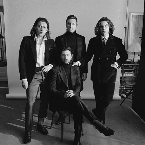 Arctic Monkeys have a very simplistic and overall very easy to read logo for their band, its unique enough to be able to be relatable and is widely known.
Arctic Monkeys are an English indie rock band who initially formed in 2002 within the city of Sheffield, performing their first gig in around 2003.
The band currently consists of four people, Nick o'malley, Alex Turner (Lead), Jamie Cook and Matt Helders.
The music video:
When the sun goes down.
Release date: YouTube music video uploaded on the 10th of December in 2008
The song became no one in the UK indie and the UK singles charts and within the top 100 in the Netherlands.
The song itself is and still is relatively popular and has since 2008 got over 18,000 views

This music video is typical of Arctic monkeys being set in a suburban setting seemingly in the middle of a typically English city with a dull colour palette with a narrative. their music video View from the afternoon is one much like the one above however it doesn't move with the characters like this one does but it does stay in a similar style.
Audience:
This music video sets the audience pretty well in a few seconds of playing , this insn children's music video this is one for late teens to middle aged people. Due to the cold feel to the video as soon as it starts its safe to assume this video is intended for those of a higher maturity rate.
Late Teens to young adults are in the stage of full maturity and in the stages of coming to terms with the world around them and as such dark depressing themes presented within this music video such as prostitution (Heavily implied due to the nature of the song teaching that after dark the dark and depressing reality of the world is shown) and themes of violence which is portrayed by the male characters within the video. The audience is targeted by the use of the colour and mature themes present as well as the lyrics presented within.
The lyrics
"So who's that girl there" as a starting point instantly portrays this audience as realising the harsh reality behind them and its only really understood by those who have matured up and have learnt of the acts while growing up. The fact the song heavily implies by the use of the name of the song and the main lyrics being "They say it changes when the sun goes down" almost contradicts the viewers age and target audience by making it seem like its just a theory an unknown, meaning that the singer is unsure about what does happen and the video is only portraying it via the narrative.
the use of the magician in places also contradicts the audience as magicians are children entertainers, and involving one in this video seems slightly off and strange; but could also heavily imply that the viewer already knows what the song is about and its adding something to ease the tension. However this involvement using the magician might also be a symbol for the good in the world and that childhood are the most innocent years of someones life and this heavily aims for late teens to young adults by doing so.
The art style throughout the video is mostly of real life settings and locations making it more realtable for people who regularly walk the streets to realise. The Lyrics of "I hope your're not involved at all" are key pointers to those of consent as the video and lyrics point towards prostitution heavily and the lyrics themselves almost aim to stop people from becoming this way within society after all the way through the song showing it in a heavily negative way.
The visuals follow one man and the lyrics follow seemingly multiple and this subtle opposition between the visuals and the music itself this could show the audience of late teens/young adults by almost speaking to them in a way saying that this scenario can happen to anyone at any point, however is apparent that males are the main negative connotations within this music video as females seem to be the victim however its unclear to see which gender of audience would fit best, as Arctic Monkeys have a pretty big following with each gender (All)
the clothing the actors wear is casual clothing and nothing flashy at all hinting towards urban teens but this is a minor point due to the setting itself being one where walking down it in a fancy suit and tie wouldn't fit.
Webpage analysis
Arctic Monkeys website is dark and depressing compared to websites like green days which are vast in colour and this shows that the constructed audience is angsty teens or people who have a more darker and gloomier take on the world. Age wise the listeners vary between 16-25 years old who love the Colour black.
The webpage itself is really really bland and dull containing mostly just links to their band details but all link to different places of which have almost the same colour palette. It is extremely simple in design and so would appeal more to teens who just want to focus on the music or a little bit of news from the band every so often. The online store link is on the webpage as well as such it's obvious that the listeners of Arctic Monkeys buy there merch.
The website is perfect for their band as it's cold and dark much like their name suggests. It also suits the demographic of low income/suburban tribes being unable to afford the luxuries of more detailed and expensive things. Advertising is featured a lot on the website giving gig times and promotions allowing the fans to connect more with the band. In the left hand corner the Arctic Monkeys logo is seen which portrays their unique style of being cold and aside. Font wise it's simple and bland nothing really too special about their font but it could be so the fans themselves only want to listen to the music. In all their webpage isn't overly spectacular and it relatively simple and to the point much like how the Arctic is represented.
 Arctic Monkeys have a very simplistic and overall very easy to read logo for their band, its unique enough to be able to be relatable and is widely known.
Audience profile
Audience profile for our music video
Potential demographics: Ages 16-25 or 18-24
most likely studying at school or at home but is in education
Generally scruffy or mixed in fashion sense potentially going through a rough time at school or just school in general and hating it.
basing our song and genre choice on bands like Arctic Monkeys the age demographic is most likely as has been noted earlier to be teens to young adults of which have access to internet services or are generally regularly socialising in general.
Habits in general are listing to music and just going through school or education in general potentially being a reject in some cases or just being low key in the popularity ladder of society.
Ethnicity wise the person most likely to be listening to is most likely predominantly white males who is almost defiantly single and fairly slim built.
the listener is potentially in some sort of employment although they could also not be and be living off mum and dad. if they were in employment it would most likely be part time work covering few hours.
Its unlikely these people are going to be complete party animals and are fairly self contained within themselves.
they are very unlikely to have any sort of body art on them whatsoever.
they are more likely to like music genres such as indie rock or rock in general as well as be into music such as pop.
Their social class its most defiantly middle to low income or from families with smaller incomes.
Thursday, 12 January 2017
evaluations of Print productions (Brief evaluations)
development of print productions (Final print production)
The CD front cover is now almost finalised now including a title to the album and small contrast fixes have been applied.
The contrasting colours and the bold highlights make the cover eye catching in appearance.

The inside covers are identical in appearance but one has been flipped and inserted to create a mirrored street effect
The right side would contain the CD while the right hand side would contain any booklet/adverts needed within the retail packaging.
The back cover is a unique take on the rest of the room by production being of a puddle of water not of a road this is due to the portrayal of emptiness I wanted to show
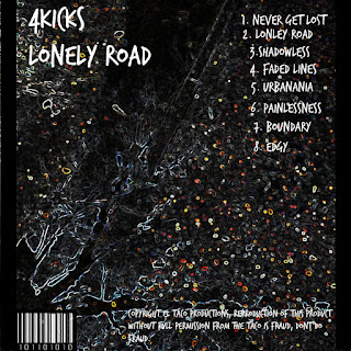
The contrasting colours and the bold highlights make the cover eye catching in appearance.

The inside covers are identical in appearance but one has been flipped and inserted to create a mirrored street effect
The right side would contain the CD while the right hand side would contain any booklet/adverts needed within the retail packaging.
The back cover is a unique take on the rest of the room by production being of a puddle of water not of a road this is due to the portrayal of emptiness I wanted to show

prelim print production ideas
A very rough alternate take.
the background would be a lot more polished and would be distinct, the idea is to have a graffiti looking background with the 4Kicks logo in the centre the insides and back covers would just be the background repeated, with the back cover being covered in text.
the text wouldn't be the black bold text shown here is would be similar but would be in the style of the font below. This idea orignated from a graffiti style that I saw, it colours and it when polished up would look consistent and eye catching. This would suit the persona of the band , being a bit rough. The background would if this was to be finished would be sleek and smooth but the text would be a lot lot more styleised.
This design is a lot more polished than the one above being a lot more distinct in its design. the design is a massively modified image of a field during sunset. The design is a rough one with no real detail to it with the cover being mostly one image, the field. This as a front cover will look alright but if it was duplicated it wouldn't look at all good. The cover is however a bit boring and has no real link towards my genre and it's just unsuiting of a cover.
This design takes on a more urban look with a run down building being the focal point of the image overlooking a canal. This cover is highly detailed and a little bit messy but the levels of contrast are completely editable meaning it would be easy to touch up the image to make it less vivid. However the urban theme from pit bands persona is shown within this image.
The lower image is one of a puddle of water and a reflection of a tree. The image has been edited with a filter much like the one above it which gives it a eye catching effect. The image would suit the inside covers of the jewel case or the poster as long as the overall font doesn't intrude upon the looks and fits in. These covers would fit perfectly into the indie rock theme and would look eye catching as well as suit the font.

This is another take upon the one above as the colours made the cover seem a lot more intriguing than the one above due to the huge variety of colour and overall angles and designs. it is however too bright to insert the title over as it looks slightly off and hidden.

Logos
The logos
The logos were scrapped during the print production stage due to the font being more suited for the band logo themselves. Below are the rough drafts for a logo, they are not used within the final production simply because the use of a logo would be too complex to fit within my desired final production and that the font would look better fitting.
 As the font i used gives more portrayal to the band and causes the band to become a lot more realistic and not dependant upon a logo to portray them within media texts.

 |
| This is the final logo design i came up with, its simple yet effective and portrays a more indie rock feel to it rather than having an individual logo attached to it. |
Fonts
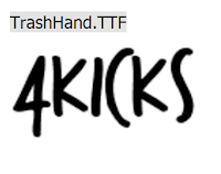
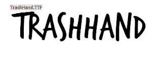
This Font is freehand in its appearance and looks like it has been done by the use of marker pens which links to our band as they are fairly rough and freehand in how they act as a band.
4kicks shows very nicely with the font as well being not too odd and different and is overall good looking as a rough graffiti style.
The font has connotations of being slightly slap dash or being a little bland which however suits our band overall.
However is font is perfect for the style of the band and the genre. And it can be recoloured and downloaded for free. The band would be portrayed as a very indie and relatively expressive band due to its goofy style.
This font is rough in its typography and seems like it’s
written in cheap graffiti and looks like it would be found in suburban towns
and cities.
The fonts colour is the generic black however this amplifies
its connotations as a rough and disorganised and potentially rebellious. This font
relates to our band by using the rough effect as our band isn’t big and known
as such the band name would look much like that. All of the test is in capital
letters and all somewhat bold which creates the rough look.
however the font itself has no placeholder for the number 4 as such if this font was to be used it would have to be able to be edited in some way to allow for the number to be shown.
The band in this case wouldn't be able to really show anything other than the fact that their own number 4 wouldn't be able to be shown within their fonts.
This font looks like a well worn text in which has been watered down.
It has connotations of being very rough and well worn.
However this font cannot be used for the print production due to it being one in which you have to pay to use.
Plane crash is an odd font being rather horror movie like in its appearance it's rough erased style makes it suitable for a indie rock band. It also is bold and stylised so it would look very good on the album cover and as song names and the like. However its slightly cheesy in appearance and looks more like an indie action movies title card font and might not be suitable for an indie rock band.
Levi Brush is a weirdly adaptable font, it suits rap music as well as rock music and would cater well to pop due to its overall graffiti like style. It wouldn't really fit our music video and would seem a bit too arty of a font as such is would look out of place within the confines of our band. This font would suit more of a punk album due to its blood splatter effect within.
Potential images for print production (Initial ideas)
Due to the grungy and fairly dull theme presented within our music video and how dull our song is using dull and grey scale imagery would suit our band and our song choice particularity well.
I tired capturing all the photos with empty and blank areas with nothing much to really look at due to the hopelessness shown within the song choice and that the genre of indie rock suits a more dull.
outlook.
The use of an urban setting is representative of the genre of indie rock; as the majority of indie rock bands live or perform in an urban environment. Urban environments also offer a lot more in the way of visually portraying glumness in which within the music video is one of the key themes, as such the images of Norwich city would be a great fit into the print productions as it would make the band more alive in terms of where they actually are, being not just in a garden shed singing.

 |
| An old factory in which lies dormant on the river edge being graffiti'd and forgotten about, some of the references towards the music video |
 |
| This picture of a giant puddle around the Nottcuts parking area is symbolic as a dull gloomy place much like the emotions featured in the music video. |

Tuesday, 10 January 2017
Location for music video
We decided to have the main performance in a garden shed this is not typical of this genre but it is similar to some music videos in the indie rock genre, such as the Kings of Leon songs; 'Sex on Fire' and 'Pyro'. The garden shed is an easily accessible location which we can use and is easy for us to change around and create an atmosphere that we want through easy control of lighting and a good amount of space. The logistics of the garden make it easy for us to control lighting and use a wide variety of shots.
The narrative will be set in a suburban area this is a common with in this genre. Shot in Norwich and the surrounding areas such as Anglia square and the area around the bottom of the market to give the music video the authentic suburban look.
The narrative will be set in a suburban area this is a common with in this genre. Shot in Norwich and the surrounding areas such as Anglia square and the area around the bottom of the market to give the music video the authentic suburban look.
Plan of music video's timeline
00:00-00:05- master shot of band
00:05-00:41 narrative, then breaks up with cut to first band shot.
00:41-00:55 band shots
00:55-01:20 narrative- girl walking out on boy
01:20-01:27 band shots
01:27-01:33 shot of boy and girls
01:33-01:46 band shots
01:46-01:
overall the narrative will go:
* Break up
* Pictures of them
* Flash backs / Walk and see girl with another person
* Breaks stuff
Shooting schedule (Updated)
Date
|
Times
|
Cast
|
Props
|
25/10/16
|
12-15
|
Jamie
Gaby
|
Phone
Bench
Stones
|
26//10/16
|
11-16
|
Jamie
Hannah
Josh
|
Drums
Guitar
Amps
|
24/11/16
|
13-15
|
Jamie
|
N/A
|
15/1/17
|
13-15
|
Jamie (Extra filler shots)
|
Guitar (Extra close ups and senarios)
|
Monday, 9 January 2017
Owl city "When can I see you again" representation case study (Process of updating)
the Song itself was released in 2012 in conjunction to the hit Disney Movie Wreck It Ralph serving as the end credits theme. The Movie itself was hugely successful in America and the UK. the song itself was and is still played at Floidas Downtown Disney district starting about 2012/2013, during the films release the song came within peak position in the Canadian top 100 tracks in 2012.
It was written and produced by Adamn Young of Owl City with added writing from Matt Thiessen and Brian Lee. Being a Disney Record it is continuously played as said before at Disney licenced locations and assets such as theme parks and stores. Owl City itself is an American project created in 2007 by Adam Young himself first getting attention on the now dead MySpace and then it got signed by Universal republic records in 2008.
The Music video itself mostly features Adam young himself in a performance type narrative but it incorporates more assets within such as movie clips from Wreck It Ralph. Adams inspiration for the song was the clear link between the characters of the movie and the ending of it being e departure of two complelty different Video Game characters.
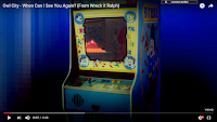
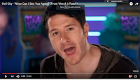
Within the video it shows Adam as a fairly young adult operating a retro style arcade machine much like the one within the movie which seems to represent the old style of gaming as cool and fun. This also backs up the generic and poor ideology that video games are for male characters and within the background during the opening the female characters are blacked out and dancing around each other and the arcade machines, portraying a possible representation that males take games more seriously; another generic and annoying convention, than the females.
the female characters although colourful are not really sexualised in anyway (which may be purely to keep the happy go lucky Disney style) however they are seen as energetic and colourful wearing colour heavy dresses and costumes, showing that females are more brighter than the men.
Unlike many of Owl city's videos females are seen through and are prominent representing that all genders (apparently there's loads) can also play video games in which goes against the stereotypes that suggest males are more likely to play games. However male dominance is shown throughout with Adam is he one with the most close up and shown in more dynamic shots possibly representing males as being more absorbed by video game culture moreso than the females which just seem to take the whole situations lightly and seem to regard it as fun.
Video games are represented as being cool and flashy as Adam around the 97 second mark suddenly dons a pair of flashy sunglasses being signifies of coolness and as it's aimed at small to young children it's a clear message that video games are cool. Adam himself is playing the game in a cool style being into it and moving around joyously (overreacting the game and showing it as being cooler than it actually is)
The music video eventually turns completely into a pixelated stage showing/representing how video games can completely absorb a person and keep them within the game for a very long time and this is backed up by the cuts to Adam playing the game, he seems to be within the screen itself and thus becoming submerged into it and becomes part of it.
There is a substantial amount of missing male actors from the video it just contains the single Male which represents male dominance and power over everything. However this is most likely a positive scenario as well as a negative one as the male is not objectifying or sexualising females in any way shape or form which might also represent that females are on the same level as males.
The music video itself is aimed at children being extremely tame in its ideologies representing video games as being fun and flashy as well as being a break from the world. As well as represent the fact that video games are for all genders and ages and as it's all live action this representation is amplified dramatically.
The representation of females could be seen by the keen eyed as being evasive and sly due to the female dancers being coloured much like that if PAC Man ghosts or similar colours, this represents a more relatable quality to this video and its older viewers, however this is most likely a nifty reference to a old retro arcade game,
Subscribe to:
Comments (Atom)


