the background would be a lot more polished and would be distinct, the idea is to have a graffiti looking background with the 4Kicks logo in the centre the insides and back covers would just be the background repeated, with the back cover being covered in text.
the text wouldn't be the black bold text shown here is would be similar but would be in the style of the font below. This idea orignated from a graffiti style that I saw, it colours and it when polished up would look consistent and eye catching. This would suit the persona of the band , being a bit rough. The background would if this was to be finished would be sleek and smooth but the text would be a lot lot more styleised.
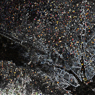
This design is a lot more polished than the one above being a lot more distinct in its design. the design is a massively modified image of a field during sunset. The design is a rough one with no real detail to it with the cover being mostly one image, the field. This as a front cover will look alright but if it was duplicated it wouldn't look at all good. The cover is however a bit boring and has no real link towards my genre and it's just unsuiting of a cover.
This design takes on a more urban look with a run down building being the focal point of the image overlooking a canal. This cover is highly detailed and a little bit messy but the levels of contrast are completely editable meaning it would be easy to touch up the image to make it less vivid. However the urban theme from pit bands persona is shown within this image.
The lower image is one of a puddle of water and a reflection of a tree. The image has been edited with a filter much like the one above it which gives it a eye catching effect. The image would suit the inside covers of the jewel case or the poster as long as the overall font doesn't intrude upon the looks and fits in. These covers would fit perfectly into the indie rock theme and would look eye catching as well as suit the font.
This is another take upon the one above as the colours made the cover seem a lot more intriguing than the one above due to the huge variety of colour and overall angles and designs. it is however too bright to insert the title over as it looks slightly off and hidden.


Some great ideas and well done for evaluating them carefully.
ReplyDelete