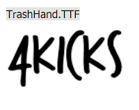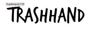

This Font is freehand in its appearance and looks like it has been done by the use of marker pens which links to our band as they are fairly rough and freehand in how they act as a band.
4kicks shows very nicely with the font as well being not too odd and different and is overall good looking as a rough graffiti style.
The font has connotations of being slightly slap dash or being a little bland which however suits our band overall.
However is font is perfect for the style of the band and the genre. And it can be recoloured and downloaded for free. The band would be portrayed as a very indie and relatively expressive band due to its goofy style.
This font is rough in its typography and seems like it’s
written in cheap graffiti and looks like it would be found in suburban towns
and cities.
The fonts colour is the generic black however this amplifies
its connotations as a rough and disorganised and potentially rebellious. This font
relates to our band by using the rough effect as our band isn’t big and known
as such the band name would look much like that. All of the test is in capital
letters and all somewhat bold which creates the rough look.
however the font itself has no placeholder for the number 4 as such if this font was to be used it would have to be able to be edited in some way to allow for the number to be shown.
The band in this case wouldn't be able to really show anything other than the fact that their own number 4 wouldn't be able to be shown within their fonts.
This font looks like a well worn text in which has been watered down.
It has connotations of being very rough and well worn.
However this font cannot be used for the print production due to it being one in which you have to pay to use.
Plane crash is an odd font being rather horror movie like in its appearance it's rough erased style makes it suitable for a indie rock band. It also is bold and stylised so it would look very good on the album cover and as song names and the like. However its slightly cheesy in appearance and looks more like an indie action movies title card font and might not be suitable for an indie rock band.
Levi Brush is a weirdly adaptable font, it suits rap music as well as rock music and would cater well to pop due to its overall graffiti like style. It wouldn't really fit our music video and would seem a bit too arty of a font as such is would look out of place within the confines of our band. This font would suit more of a punk album due to its blood splatter effect within.


Well done for exploring several different fonts, however, you need to include the following terms in your analysis: genre, audience appeal, also consider how the font 'constructs' the band.
ReplyDelete